
Colours are a powerful tool. They play a huge role in influencing our personality, which they guide and shape for our various moods.

Various colours have profound and firm effect on people but it usually varies from person to person. To help understand their effect we, at Rainbow Paint Industries have created this Colour Guide to discuss their effects.
The psychology of colour is based on the mental and emotional effects colours have on sighted people in all aspects of life. There are some very subjective pieces to colour psychology as well as some more accepted and proven elements. Keep in mind, that there will also be variations in interpretation, meaning, and perception between different cultures.
We Hope you find this guide useful and it would further help you in understanding the dynamic and vibrant of selecting the right colour for you.
There are four psychological primary colours – red, blue, yellow and green.

They relate respectively to the body, the mind, the emotions and the essential balance between these three. The psychological properties of the basic colours are discussed in our Rainbow Colour Guide to assist you in understanding how important it is to select your colours and what various colours show about your personality.
Red
![]() Positive: Physical courage, strength, warmth, energy, basic survival, 'fight or flight', stimulation, masculinity, excitement.
Positive: Physical courage, strength, warmth, energy, basic survival, 'fight or flight', stimulation, masculinity, excitement.
Negative: Defiance, aggression, visual impact, strain.
Red is a powerful colour. Not only Red is one of most emotionally intense colour and the colour for love but it attracts our attention almost instantaneously. It is also one of the primary psychological colours.
It is not only stimulating, friendly and full of life but at the very same time is fiery, demanding and aggressive. The question here is: What do you gain by painting your room red? …. It’s simple, the colour Red affect us both physically and mentally. It increases enthusiasm, stimulates energy, encourages action and confidence and creates a sense of protection from anxiety and fear. Although Red is a universal colour but it tends to show masculinity or more appropriately the ability to be confident.
As seen in clothing, people who wear Red clothes get noticed more quickly, similarly in paints – Red walls always seems to the centre for attention and keep the adrenaline pumping.

Yellow![]()
![]() Positive: Optimism, confidence, self-esteem, extraversion, emotional strength, friendliness, creativity.
Positive: Optimism, confidence, self-esteem, extraversion, emotional strength, friendliness, creativity.
Negative: Irrationality, fear, emotional fragility, depression, anxiety, suicide.
Yellow shows optimism, enlightenment, and happiness. It carries the promise of a positive future and is often depicted as the colour of the sun, which symbolizes light. Yellow will advance from surrounding colours and instil optimism and energy, as well as spark creative thoughts.
Yellow is psychologically the happiest colour in the colour spectrum and is often described as cheery and warmth. Yellow can also increase metabolism so a portion of the kitchen can be painted with it. You might have noticed that it is one of the most visible colour and also the most attention getting colour. It is frequently used to draw notice such as on traffic sign or advertisements.
Red and yellow complement each other and are there mostly seen together. Yellow also increases communication hence complements Red’s confidence but be careful too much of it, or the wrong tone in relation to the other tones in a colour scheme, can cause self-esteem to plummet, giving rise to fear and anxiety.
Therefore it is advisable to also use yellow and red together with other soft tone or natural colour to keep a perfect balance which not only lifts your mood but also your health, psychology and your personality. 
Blue![]()
![]() Positive: Intelligence, communication, trust, efficiency, serenity, duty, logic, coolness, reflection, calm.
Positive: Intelligence, communication, trust, efficiency, serenity, duty, logic, coolness, reflection, calm.
Negative: Coldness, aloofness, lack of emotion, unfriendliness.
Blue is the colour of the mind and is essentially soothing; it is the overwhelming “Favourite colour”. The colour of the sky and the ocean, Blue is recognized as a constant in our lives. It causes the opposite effect as Red. Blue affects us mentally and is seen as trustworthy, dependable and committed.
Here is a question for you: Why is the colour BLUE associated with being Cool?
The answer is that Blue is peaceful and tranquil, Blue causes the body to produce calming chemicals and because of this it is often used in bedrooms. It is observed that people are more productive in Blue coloured rooms and extensive studies have shown that weightlifters are able to handle heavier weights in Blue gyms.
It should be noted that not all blues are serene and sedate. Electric or brilliant blues become dynamic and dramatic. It should be carefully matched with other colours to achieve its full effects. We here at Rainbow Colour Advisory Services, not only professionally match the colour to set the mood and environment but we tailor it to your expectation.
Blue is the least “Gender specific” colour and has an equal appeal to both men and women. Therefore it is advisable to keep a perfect balance which not only lifts your mood but also your health, psychology and your personality.

Violet![]()
 Positive: Spiritual awareness, containment, vision, luxury, authenticity, truth, quality.
Negative: Introversion, decadence, suppression, inferiority.
Purple, often described as violet, has the shortest wavelength. Purple or “Velvet” as it is referred in our shade card, embodies the balance of red simulation and blue calm. This dichotomy can cause unrest or uneasiness unless the undertone is clearly defined at which point the purple takes on the characteristics of it undertone.
Purple has a sense of mystic and royal qualities and is often liked by very creative or eccentric types and is the favourite colour of adolescent girls.
Purple affects us both mentally and physically as it is Uplifting. It is Calming to the mind and nerves and offers a sense of spirituality. It encourages creativity and has a touch of luxury associative to it.
Now we at RAINBOW COLOUR ADVISORY SERVICES often ask a question about every colour: Why should I choose this colour? …The answer is never really simple.
It encourages deep contemplation or meditation and has associations with royalty. It symbolizes the finest possible quality, which is shown by its position being the last visible wavelength before ultraviolet ray; which also explains its mystic nature.
Beware! Although purple may stand as a symbol of royalty and quality but excessive use of purple can bring too much introspection and the wrong tone( colour combination) bring about a cheap and nasty effect which is devastating to your colour karma and personality.
Use our Rainbow Colour Advisory service to avoid such disturbing & devastating effects and to keep a perfect balance which not only lifts your mood but also your health, psychology and your personality. Please remember our Rainbow Colour Advisory Service is totally free of cost and is the finest way to get the perfect combination for your home. 
White

![]()
Positive: Hygiene, sterility, clarity, purity, cleanness, simplicity, sophistication, efficiency.
Negative: Sterility, coldness, barriers, unfriendliness, elitism.
The colour White exhibit purity, cleanliness, and neutrality. Just as black is total absorption, white is total reflection. It reflects the full force of the spectrum into our eyes.
The colour white symbolizes purity, it aids mental clarity and if used correctly can allow us to calm our nerves and create an aurora which relaxes our mind. It is extensively used in living rooms and lounges, thus evokes purification of thoughts or actions. Although it is not as productive as the colour blue but white calm the mind and enables us to a fresh beginning. It encourages us to clear clutter or obstacles.
As mentioned before, white is suitable for your living rooms and lounges. It is a universal colour that complements nearly every colour so could be used in contrast with other heavier colours but Beware!; Although white is universal but too much excessive usage might upset the delicate balance of your environment.

Green
![]() Positive: Harmony, balance, refreshment, universal love, rest, restoration, reassurance, environmental awareness, equilibrium, peace.
Positive: Harmony, balance, refreshment, universal love, rest, restoration, reassurance, environmental awareness, equilibrium, peace.
Negative: Boredom, stagnation, blandness, enervation.
Green symbolizes nature and is the colour of the religion Islam. It is the easiest colour on the eye and can improve vision. It has a calming and refreshing feeling because of which it is ideally suited for use in bedrooms. Hospital often uses green to relax its patients. Its calming properties are put to use when people who appear on TV sit in “Green Rooms” to relax. The scientific reason to this is that the colour green occupies more space in the spectrum of light visible to the human eye and is second only to blue as a favourite colour. Green is the pervasive colour in the natural world and hence is an ideal backdrop in interior design because we are so used to seeing it everywhere.
This colour affects us both physically and mentally as it is soothing to the eye, which relaxes us mentally as well as physically. It helps ease depression, nervousness and anxiety.


Pink![]()
![]() Positive: Physical tranquillity, nurture, warmth, femininity, love, survival.
Positive: Physical tranquillity, nurture, warmth, femininity, love, survival.
Negative: Inhibition, emotional claustrophobia, emasculation, physical weakness.
Pink is one of the favourite among young women and children alike. It is ever popular and is mostly used in much excessive the nearly women of ages.
Pink being a tint of red, also affects us physically, but it soothes, rather than stimulates. It is a powerful colour and represents the feminine principle; it is nurturing and physically soothing. But BEWARE too much of Pink can be physically draining and can be somewhat weakening. 
Black![]()
 Positive: Sophistication, glamour, security, emotional safety, efficiency, substance.
Negative: Oppression, coldness, menace, heaviness.
Black is authoritative and powerful; because black can evoke strong emotions too much can be overwhelming. A classic colour for clothing possibly because it makes the wearer appear thinner and more sophisticated.
Black is all colours, totally absorbed. The psychological implications of that are considerable. It creates protective barriers, as it absorbs all the energy coming towards you, and it enshrouds the personality. Black is essentially an absence of light, since no wavelengths are reflected and it can, therefore be menacing; many people are afraid of the dark. Positively, it communicates absolute clarity, with no fine nuances. It communicates sophistication and uncompromising excellence and it works particularly well with white. Black creates a perception of weight and seriousness. It is a myth that black clothes are slimming.
How the colour black affects us physically and mentally
* feeling inconspicuous
* A restful emptiness
* Mysterious evoking a sense of potential and possibility.
Orange
![]() Positive: Physical comfort, food, warmth, security, sensuality, passion, abundance, fun. Negative: Deprivation, frustration, frivolity, immaturity.
Positive: Physical comfort, food, warmth, security, sensuality, passion, abundance, fun. Negative: Deprivation, frustration, frivolity, immaturity.
Orange, a close relative of red, sparks more controversy than any other hue. There is usually strong positive or negative association to orange and true orange generally elicits a stronger "love it" or "hate it" response than other colours. Fun and flamboyant orange radiates warmth and energy. Interestingly, some of the tones of orange such as terra cotta, peach or rust have very broad appeal.
How the colour orange affects us mentally and physically
* Stimulates activity
* Stimulates appetite
* Encourages socialization


Gallery
View colour catalogues, inspirations, event pictures and more in our image gallery. View Our Gallery
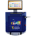
Colour Magic
Get virtually unlimited colours through our computerized tinting system. View Colour Magic

Color Calculator
Get accurate estimates of your paint related requirement using our paint calculator. View Our Calculator
| Select Color Theme |  |
 |
 |
 |
 |
 |
 |
 |

|  |
 |
 |  |  |